Footer Too Wide for Mobile WordPress: Expert Solutions for Responsive Design
Naveed
November 27, 2024
Understanding Footer Too Wide for Mobile WordPress
In 2023, there were about 6.974 billion smartphone users worldwide. This is a 6.2% increase from the previous year.Almost everyone has access to smartphones these days, showing huge potential for businesses looking to target a wider audience through digital marketing services. A mobile responsive design is almost like oxygen to your online existence. Most of these websites are on WordPress and sometimes it leaves website owners and developers frequently complaining about the “footer too wide for mobile WordPress” issue during development process. A footer that does not properly adapt to mobile devices can have a substantial impact on user experience, site aesthetics, and overall mobile responsiveness. This detailed post will walk you through several ways for addressing the “footer too wide for mobile WordPress” issue and ensuring your website looks great on all devices.
Why Footer Responsiveness Matters
When a footer is too wide for mobile WordPress sites, it can:
- Create horizontal scrolling
- Misalign content
- Reduce readability
- Negatively impact user experience
- Potentially harm search engine rankings
Comprehensive Solutions for Footer Too Wide for Mobile WordPress
1. CSS Media Query Optimization
One effective method for addressing this particular challenge is to employ targeted CSS media queries. These queries enable you to tailor the styling of specific elements based on various factors such as screen size, device orientation, and even the user’s preferences. You can adjust the details according to your needs.
					@media screen and (max-width: 768px) {

    .site-footer {

        width: 100%;

        max-width: 100%;

        padding: 15px;

        box-sizing: border-box;

        display: flex;

        flex-direction: column;

        align-items: center;

    }


    .footer-column {

        width: 100%;

        text-align: center;

        margin-bottom: 15px;

    }

}
Key Benefits:
- Ensures footer spans full mobile width
- Prevents horizontal scrolling
- Centralizes footer content
- Maintains clean, responsive design
2. WordPress Theme Responsive Settings
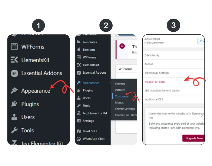
Many latest WordPress themes provide integrated responsive options designed expressly to address any worries about footer width constraints. These adaptable settings ensure that the footer content is shown optimally across a variety of platforms, including smartphones, tablets, and desktop PCs.

- Navigate to Appearance > Customize
- Look for “Mobile Responsiveness” or “Footer Settings”
- Adjust column widths and padding
- Test across multiple device sizes
- Pro Tip: When dealing with "footer too wide for mobile WordPress" problems, always preview your changes on various device simulators.
3. Flexbox and Grid Layout Techniques
Using advanced responsive design strategies can efficiently handle and overcome common footer width issues encountered while working with WordPress. Using these complex tactics, web developers may ensure that a website’s footer section adapts fluidly across several devices and screen sizes. These techniques include utilizing CSS media queries like below one.
					.site-footer {

    display: flex;

    flex-wrap: wrap;

    justify-content: space-between;

}


@media screen and (max-width: 768px) {

    .site-footer {

        flex-direction: column;

        align-items: center;

    }

}
Advantages:
- Dynamic content arrangement
- Seamless mobile adaptation
- Minimal code complexity
4. Plugin-Based Solutions
There are numerous WordPress plugins available that are specifically designed to address the common issue of having a footer that appears too wide on mobile WordPress websites. These plugins can efficiently manage and rectify the problem, ensuring that the footer is optimized for various screen sizes and devices.
- Advanced Mobile Responsive Settings
- WP Mobile Responsive
- Footer Responsive Toolkit
5. Manual Width Adjustment Techniques
Developers that are confident in their coding abilities might consider implementing some exact tweaks to improve the responsiveness of footers on websites. One effective way to accomplish this is to add the following code snippet to the theme’s functions.php file. When activated, this snippet will apply appropriate style tweaks to ensure that the footer container adjusts properly to diverse screen widths, with a focus on devices with a width of 600 pixels or smaller. Setting the container’s width to 95% and centering it with a margin of 0 keeps the design visually appealing and user-friendly on smaller displays. This approach has the potential to dramatically improve the entire user experience, particularly in the rapidly expanding field of online design and development.
					function custom_footer_responsive() {

    ?>

    <style>

        @media screen and (max-width: 600px) {

            .footer-container {

                width: 95% !important;

                margin: 0 auto;

            }

        }

    </style>

    <?php

}

add_action('wp_head', 'custom_footer_responsive');
Common Mistakes to Avoid
When addressing “footer too wide for mobile WordPress” challenges:
- Don’t use fixed pixel widths
- Always test on multiple devices
- Consider content hierarchy
- Maintain readability
- Preserve brand consistency
Performance Considerations
While solving footer responsiveness, remember:
- Minimize custom CSS
- Use efficient media queries
- Leverage browser caching
- Optimize image sizes
Professional Troubleshooting Checklist
Quick Diagnostic Steps
- Validate CSS
- Check theme compatibility
- Test across browsers
- Use developer tools
- Verify plugin interactions
Conclusion: Mastering Mobile Footer Responsiveness
Solving the “footer too wide for mobile WordPress” challenge requires a strategic approach combining technical skills, design principles, and continuous testing. By implementing these solutions, you’ll create a seamless, professional mobile experience that keeps users engaged and reflects your brand’s commitment to quality.
Final Recommendations
- Prioritize responsive design
- Continuously test and iterate
- Stay updated with WordPress developments
- Consider professional consultation for complex implementations
Table of Contents
Dont Hesitate To Contact Us
Make Contact With Us & Get Best & Cheap Digital Solutions. Get Started Now & Boost Your Online Presence.
